
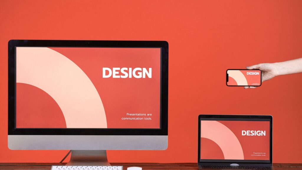
Posters continue to serve practical purposes in schools, workplaces, retail spaces, conferences, and community events. Even as digital communication expands, physical print remains a dependable way to capture attention in shared environments.
For beginners, modern poster design software reduces the need for formal design training. Instead of starting from a blank canvas, users can rely on structured templates, layout grids, print presets, and export controls that guide decisions step by step.
What differentiates tools in this category is workflow clarity: how quickly users can choose dimensions, organize content, control typography, and prepare files for professional printing. Many platforms now provide built-in safeguards for bleed, resolution, and alignment.
One accessible starting point is creating custom print posters from Adobe Express, which offers print-sized templates and guided formatting. The steps below apply broadly across poster design software, using Adobe Express as a practical reference example.
Step-by-Step Guide for Using Poster Design Software
Step 1: Choose the Correct Size and Template
Goal
Set up a document that matches your intended print format and use case.
How to do it
- Select a standard print size (e.g., 11×17 inches, A3, 24×36 inches).
- Use preset poster templates to avoid layout guesswork.
- Confirm portrait or landscape orientation.
- Verify units (inches vs. millimeters).
- Review bleed settings if available.
What to watch for
- Designing in social media dimensions instead of print sizes.
- Ignoring margin guides.
- Selecting decorative templates that overpower the message.
- Forgetting printer specifications.
Tool notes
If working in a more layout-focused environment, Lucidpress can help users define exact page dimensions and margin guides with precision controls.
Step 2: Define the Core Message First
Goal
Clarify what the poster needs to communicate before editing design elements.
How to do it
- Draft a short headline (6–10 words).
- Write key supporting details (date, location, contact).
- Rank information by importance.
- Remove unnecessary sentences.
- Confirm readability from a few feet away.
What to watch for
- Paragraph-length explanations.
- Vague language.
- Overly promotional tone.
- Redundant details.
Tool notes
For organizing draft copy before placing it into a layout, tools like Notion can help structure content and refine messaging before design begins.
Step 3: Establish Clear Visual Hierarchy with Typography
Goal
Make the most important information visually dominant.
How to do it
- Use one primary headline font.
- Pair with one supporting font.
- Create size contrast rather than adding more fonts.
- Use bold for emphasis instead of excessive capitalization.
- Keep text alignment consistent.
What to watch for
- Using more than two font families.
- Low contrast between text and background.
- Long center-aligned paragraphs.
- Decorative fonts for body text.
Tool notes
If reviewing readability across multiple text blocks, Grammarly can assist with clarity and sentence length adjustments before final layout placement.
Step 4: Use Color Strategically
Goal
Maintain readability and visual cohesion.
How to do it
- Limit the palette to 2–3 core colors.
- Ensure strong contrast between text and background.
- Use accent colors for emphasis only.
- Test legibility in grayscale.
- Maintain brand consistency when relevant.
What to watch for
- Light text on light backgrounds.
- Overuse of gradients.
- Neon colors without confirming print compatibility.
- Inconsistent color usage across elements.
Tool notes
If you need to validate accessibility contrast levels before finalizing colors, WebAIM’s contrast checker (browser-based) can help confirm readability standards.
Step 5: Add Images or Graphics Thoughtfully
Goal
Support the message visually without clutter.
How to do it
- Use 300 DPI images for print.
- Crop tightly to remove distractions.
- Keep graphics secondary to the headline.
- Leave space around important elements.
- Avoid excessive overlays.
What to watch for
- Using low-resolution web images.
- Stretching images disproportionately.
- Placing text over busy areas.
- Ignoring licensing terms.
Tool notes
If sourcing photography externally, Unsplash can provide high-resolution images suitable for print when used appropriately.
Step 6: Prepare the File for Print Production
Goal
Export a file that meets professional printing standards.
How to do it
- Enable bleed if required (typically 0.125 inches).
- Keep critical text within safe margins.
- Export as a high-quality PDF.
- Confirm 300 DPI output.
- Review color mode (CMYK if required).
What to watch for
- Exporting as low-resolution JPG.
- Forgetting to embed fonts.
- Ignoring printer trim guidelines.
- Skipping zoom-level proof checks.
Tool notes
If coordinating printing specifications and approvals, project management platforms like Asana can track file revisions and vendor deadlines.
Step 7: Plan Distribution and Tracking
Goal
Ensure the poster is deployed effectively and measurable where relevant.
How to do it
- Confirm approved posting locations.
- Add a QR code if tracking is needed.
- Save editable files for updates.
- Create a digital version for email sharing.
- Archive the final print version separately.
What to watch for
- Printing without location permission.
- QR codes that are too small.
- Losing source files.
- Inconsistent version control.
Tool notes
If generating QR codes for tracking, QR Code Generator tools can create scalable codes suitable for high-resolution print.
Common Workflow Variations
Photo-Based Promotional Poster
Start with a strong focal image and overlay minimal text. Keep contrast high and avoid overcrowding.
Minimalist Typographic Poster
Use bold headline typography with ample white space. This approach works well for announcements and quotes.
Informational Academic Poster
Use grid alignment and consistent section headers. Keep visual structure clean and predictable.
Small-Batch Event Series
Duplicate a master template and update dates or locations while maintaining layout consistency.
Before You Start Checklist
- ☐ Confirm final print dimensions
- ☐ Gather logos and brand colors
- ☐ Prepare 300 DPI images
- ☐ Draft headline and supporting copy
- ☐ Verify event details
- ☐ Confirm printer requirements
- ☐ Choose orientation
- ☐ Establish timeline
Pre-Export / Pre-Order Checklist
- ☐ 300 DPI resolution confirmed
- ☐ Bleed enabled (if required)
- ☐ Safe margins respected
- ☐ Fonts embedded
- ☐ Spelling reviewed
- ☐ Color contrast verified
- ☐ PDF export selected
- ☐ QR code tested
- ☐ Final preview at 100% zoom
Common Issues and Fixes
Images appear blurry in print
Replace with higher-resolution files. Confirm size scaling does not exceed native resolution.
Text is trimmed during printing
Increase margin spacing and confirm bleed configuration.
Colors shift unexpectedly
Switch to CMYK if required by the printer and request a proof copy.
Poster feels crowded
Reduce text volume and increase spacing between elements.
QR code fails to scan
Increase size and maintain a clean background around the code.
Alignment looks uneven
Use built-in alignment guides and snap-to-grid tools
How To Use Poster Design Software: FAQs
Is a template necessary for beginners?
Templates reduce layout decisions and help maintain hierarchy, making them useful for first-time designers.
What file format is best for print?
A high-quality PDF is typically preferred for professional printing.
How much content should fit on a poster?
If the primary message cannot be understood in a few seconds, simplify it.
Can one design be reused digitally?
Yes, but create separate exports optimized for screen dimensions and resolution.
Do I need advanced design software?
Most poster design software now includes templates, presets, and print tools sufficient for non-designers.